Creating a call-to-action message that engages your visitors to take action is more complex that most people think. It’s more than just adding ‘Buy Now!’ to a caption or website button. Here are a few helpful tips for creating clear and effective calls-to-action that will hook your audience and generate more leads.
What is a call-to-action?
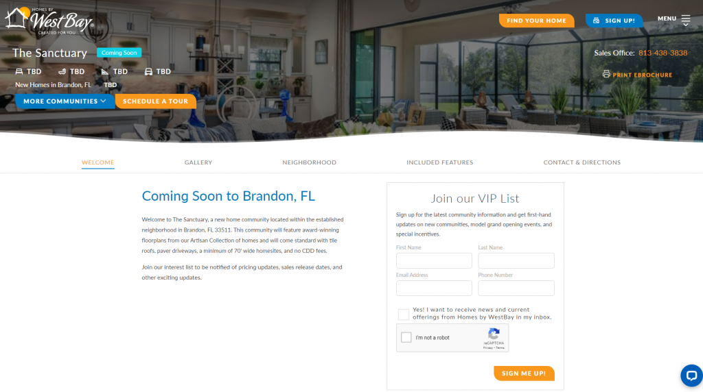
A call-to-action (CTA) is a prompt that tells your audience to do something specific. They’re usually found at the end of a blog post, webpage, eblast, or ad, but can also appear on social media messages. An action is anything you want your visitor to do next. For a new home builder, this action could be: Join VIP/Interest List, Schedule an Appointment, Contact Us, Save Favorites, View Floorplans, Chat Now, Get Directions, Sign Up for the Newsletter, and more.
An effective CTA gives people a reason to click through while explaining why they should. If you want your audience to do a specific action, don’t leave it up to chance and hope they do it; you need to tell them what to do next.
CTAs focus visitors’ attention on completing a specific action. Here are the components of an effective call-to-action.
Be clear and direct
Your CTAs should be clear and tell your audience exactly what you want them to do. Using action words at the beginning of your CTA, like “Subscribe to our newsletter” or “Join the Interest List” gets your point across quickly.

Create urgency
FOMO (the fear of missing out) is an effective motivator. That’s why the word “now” is used so frequently in CTAs. People tend to move faster when they believe they might miss out on an opportunity. Using a phrase like “limited time” is sure to help generate more leads if you’re running a special promotion.
Make the benefit clear
Basically, what’s it in for your audience? Explain why they should care and exactly what to expect to gain by clicking through. An example of this would be something like “Sign up today and be the first to know when this community becomes available” where you stated the desired action (sign up today) but also why they should take that action (get more information).

Make it easy
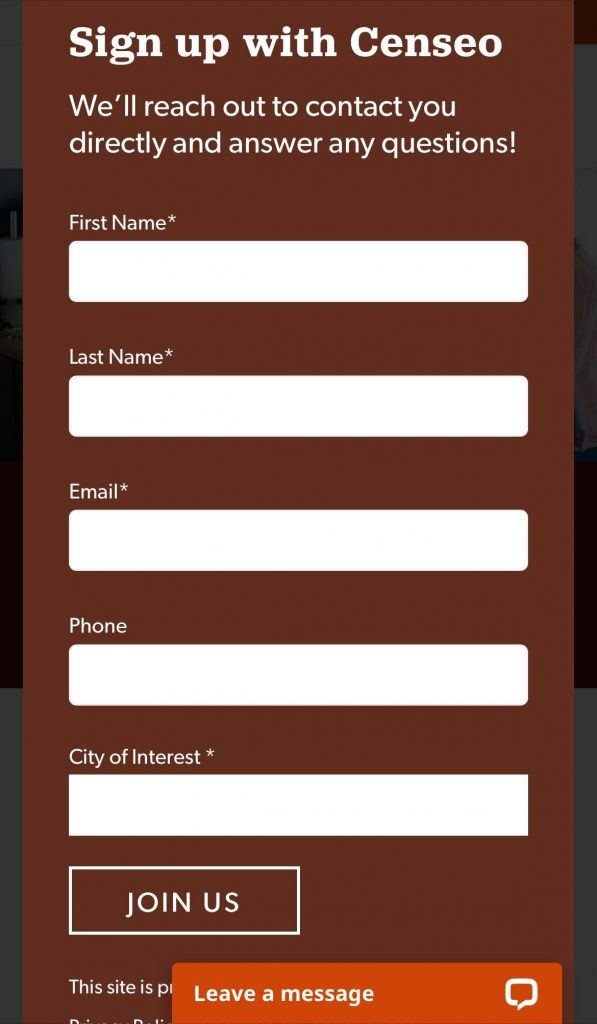
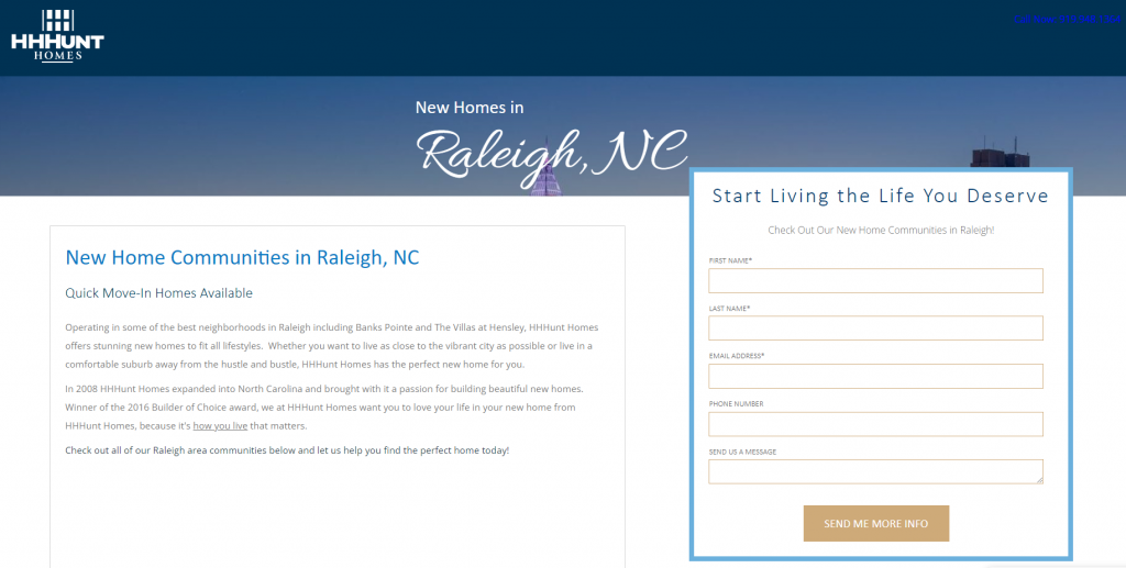
Make it easy for your audience to complete the desired action, especially on mobile. If you want them to signup, limit the amount of required information. Focus on just getting their first and last name, and email address.

Make it stand out
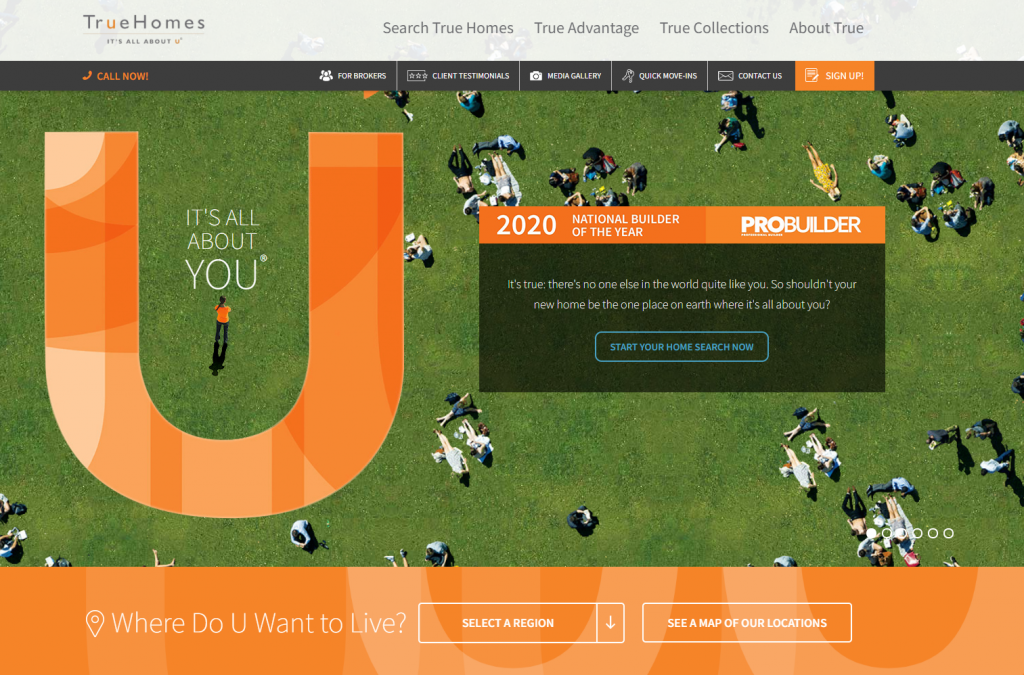
The most effective CTA is the one your audience can find. Make sure your CTA stands out on the page, whether it’s a link, image, or button. CTAs work best when they’re placed:
- Above the fold on a landing page
- In a pop-up message, whether a welcome message or a “before you go” pop up before leaving a page
- At the end or in the middle of a blog post
- At the end of a lead-capture form
Be sure to include white space (empty area) around your CTA so it draws the eyes. Without white space, your CTA can get lost in a sea of information.

Test, test, test
Experiment to find out what works best for your audience. Test the text, location, size, and shape of your CTA, and the color used to hone in on what your specific audience is drawn to.
CTAs may seem tiny in comparison to your other marketing activities but they have a big impact on your success. Creating an effective CTA can mean more leads and more homes sold.
It’s never too early to start planning for your future success. Graphic Language can help fine-tune your digital marketing strategy so you can drive the highest quality traffic and bring in the highest quality leads. Connect with us to see how we can partner in your digital marketing success.
