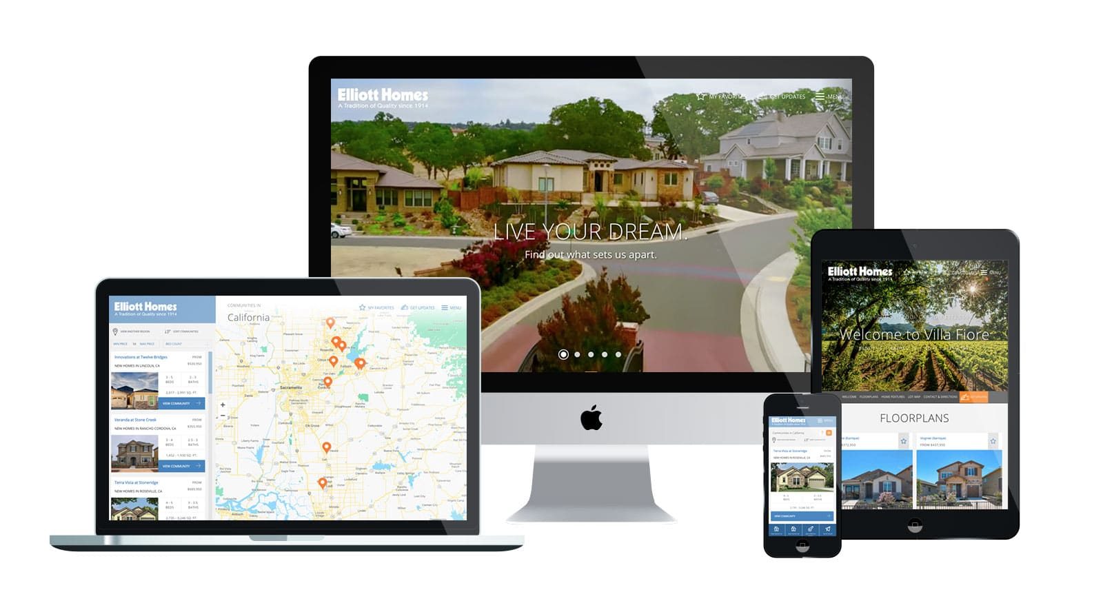
It’s a fact: you WILL be judged by your website. Home shoppers will gauge the quality of your new homes and services based on the quality of your website and online presence. Make sure the first impression is the right one!
How Much Time Do Home Shoppers Spend on Your Website?
If you’re on the fence about the importance of website design and customer experience, consider these stats: 55% of all visitors spend fewer than 15 seconds on a website. In fact, it takes the average visitor just .05 seconds to decide whether they like a website or if they’ll leave.
So not only does your first impression have to be strong, but you also have to make it quickly. Does your website stand up to that sort of snap judgment?
Why Homebuilders Should Invest in Good Web Design
Great web design inspires trust in your business. After all, 75% of users admit to making judgments about a company’s credibility based on their website’s design. Now that 89% of homebuyers use the internet at some point during their home shopping experience (with 42% making an online search the very first step they take) your website is the best chance of being a customer’s “first impression” of your company and new homes. And it turns out the look and feel of your website are the primary drivers of that impression:
- 94% of a visitor’s first impressions are design-based. Visual appeal and ease of navigation have the biggest influence on people’s impressions of your brand. You may have the information homebuyers want but that’s useless if they can’t find it easily. Remember: the best content cannot overcome the effects of poor design.
- First Impressions can last for years. Even additional impressions, no matter how contradictory, cannot make up for the first impression. For homebuilders, it could mean the difference between getting a sale and future recommendations or no sale.
- Positive first impressions lead to higher satisfaction. The homebuyer’s first impression of your website can affect their perception of doing business with your company. If they have a positive experience on your website, they will often assume their home buying experience will also be a positive one. Negative first impressions strain satisfaction, leading to those buyers you’ve all had that complain about every minor detail during the contract, build and warranty process.
What Makes a Good User Experience on a Homebuilder Website?
Over our 20+ years of building compelling online home shopping experiences, we’ve identified five truths of great user experience design that makes a homebuilder’s website engaging and effective in retaining (and converting) traffic:
- Give a proper introduction: Make sure the home shopper can clearly understand what you are all about within a second or two of hitting your website!
- Be easy on the eyes (and the brain): Visual clutter or chaos will lead to quick exits. Thoughtfully manage and focus the visitor’s attention on what is most important, like your find-a-home functionality, promotions and move-in ready homes. This goes for copy as well! Make sure it’s clear, concise and talks to your visitors in a language they understand; leave the jargon in the office.
- Address what’s important to the homebuyer: What’s important to the homebuyer may be different from what you, the homebuilder, feel is important! We understand that you have a great back story about how your company started or how much you give back to the local community. But home shoppers are more interested in your product, locations and price during the discovery phase of the process. Make it easy for them to find what they care about most; if they like what they see, they’ll take more time to learn about your company later on.
- Make conversions attainable & desirable: Use simple wording and intuitive paths to provide clear, obvious, and easy to complete steps for lead generation. If home shoppers find your interest list sign up is too long, they’ll abandon it before you’re able to capture that information.
- The user experience does not stop at the point of entry: Having a polished homepage or marketing landing page is not enough. You must carry that user experience throughout your website in order to be effective and create a positive impression.
With the bulk of the home shopping experience moving online, it is important for your website to be a true reflection of the quality of your homes and the homebuying experience that you offer.
Not sure that it is? Contact us for a free User Experience Evaluation for your homepage.
